ShopDreamUp AI ArtDreamUp
Deviation Actions


Description
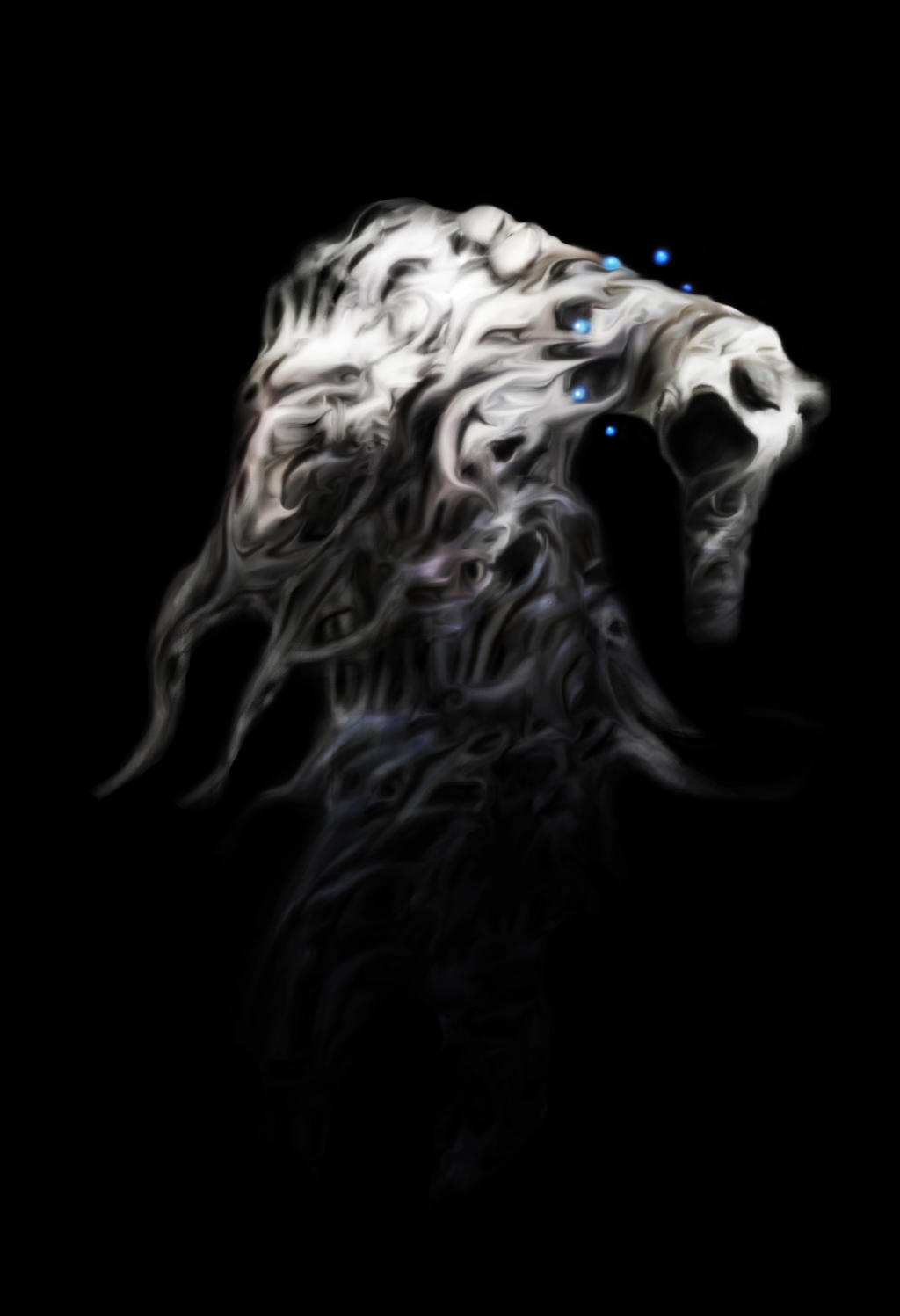
I'm not my self when i am depressed, i am something different, i am a monster...
I drew this picture back in middle school and decided to redo it.
Original here --->[link]

So, have i improved? Critique appreciated !!!
collar is supposed to look like they are floating orbs!
EDIT - after reading all of the wonderful critiques, comments and suggestions i decided to do some more work on it, hopefully i didn't ruin it! Uploaded new version.
you can find what it looked like before i did the update here ----> [link]
note: Done 10000 by 14000
>
September 5th - Edited some stray pixels, cleaned up some lines. As of now, i am DONE working on this project and do not plan to make any more edits.
>
September 19th - God damit. Just realized that there is some weird polarization going on near the legs. I'll fix this and re-upload later.
I drew this picture back in middle school and decided to redo it.
Original here --->[link]
So, have i improved? Critique appreciated !!!
collar is supposed to look like they are floating orbs!
EDIT - after reading all of the wonderful critiques, comments and suggestions i decided to do some more work on it, hopefully i didn't ruin it!
Uploaded new version.you can find what it looked like before i did the update here ----> [link]
![[link]](https://www.deviantart.com/users/outgoing?http://i1215.photobucket.com/albums/cc519/nevikelmo/blue.jpg)
note: Done 10000 by 14000
>
September 5th - Edited some stray pixels, cleaned up some lines. As of now, i am DONE working on this project and do not plan to make any more edits.
>
September 19th - God damit. Just realized that there is some weird polarization going on near the legs. I'll fix this and re-upload later.
Image size
4565x6671px 4.7 MB
© 2011 - 2024 X-Cannibal
Comments18
Join the community to add your comment. Already a deviant? Log In
This is so wonderfully original. I love it! The mood is both creepy and sad, you've managed to capture a lot of emotion. I definitely think you've done some improvements since the original, this piece has a great sense of lighting that the original lacked. There is also better contrast, the folds are very well done. You've created a strong sense of balance with lights and darks, and I like the hints of color in the shading. It has a sort of foggy, misty look to it which I think gives it a dream-like quality, which is wonderful. I would however suggest adding a bit more detail to parts such as the top hump, the top of the head and the front part of the chest, which are all well blended but need a bit more detail because at the moment they look a bit blurry. This is less apparent in the small view, but in the full-sized version I feel the blurriness is distracting from the piece. Overall though, great job!